Coffee isn’t the only thing that flows in coffee shops: the flow of something else is just as vital to their existence.
The other thing is customers. If you visit coffee shops regularly, and we have a feeling you do, you are bound to have experienced what happens when customer flow goes wrong, we all have. As a customer, these things are irritations. For a coffee shop owner, they spell disaster and they can strike even before your customer makes their way through your door.
As few as four people waiting to be served can look like a crowded doorway and one potential customer after another could walk past in the hope of finding somewhere less busy. Every seat in your shop could be empty but customers could be passing by because your store looks too crowded.
In so many shops, take-out customers wait for their coffee shoulder to shoulder with drink-in customers trying to get past them to their seats. This take-out log-jam is a double whammy, because your take-out customers feel like they are an annoyance, not how you ever want a customer to feel, and your stay-in customers begin their stay with an impression of poor organisation and stress which is unlikely to be replaced with anything more positive.
Just keeping lids and condiments in a discrete area away from the people around the till and the pass eases the flow of the customers, disperses them and can be a way to move them towards a display of merchandise and reusable cups.
Individual cups of coffee are a very slow way to make a profit: as you know, sales of food and merchandise can boost a shop’s revenue and margin massively. This isn’t going to happen if customers are rushed past, or pushed uncomfortably against, your displays. Nobody wants their customer thinking “never mind, I’ll just grab a coffee, I can buy a sandwich at…”, or “forget it, I’ll check out reusable cups on Amazon tonight”.
In an ideal world a customer should be subtly guided on a journey around a coffee shop. Not just subtly but smoothly too, because customers either come in to quickly buy a coffee to take away or they are there to relax. This journey needs to include some very important destinations – important to the shop-owner.
Example of Customer Flow

Perhaps the most productive feature of this journey is that as much of it as possible must take place before the customer reaches the till. Having the till at the far end of the display is the natural way to achieve this. Simply ensuring that the customer is gently “given the opportunity” to see what is available and has enough time for either considered or impulse purchases before the final decisive moment makes sense for the customer and the cafe. For the customer, the experience is more relaxed and less pressured and for the cafe owner, the customer is given the greatest opportunity to spend more. Of course, if this is the path along which the customers naturally flow, should a queue happen to form, then along this display would be where it would trail: not an awful prospect for the coffee shop.

Most coffee shops display their coffee menus big and bold behind the bar, it saves time taken by regular, distracting queries such as ranges and sizes of drinks and prices. Taking these questions out of the equation means that other opportunities to increase revenue can be taken. It also helps customers who feel less than confident in a speciality coffee shop (these customers will bear talking about more in the future) and who might take the option of not buying anything rather than feeling stupid asking about what kind of coffee is available. These customers are a reason why a bold store-front display of the soft drinks available is a good idea as they will definitely feel that they will be judged by walking up the barista and asking about a non-coffee drink.
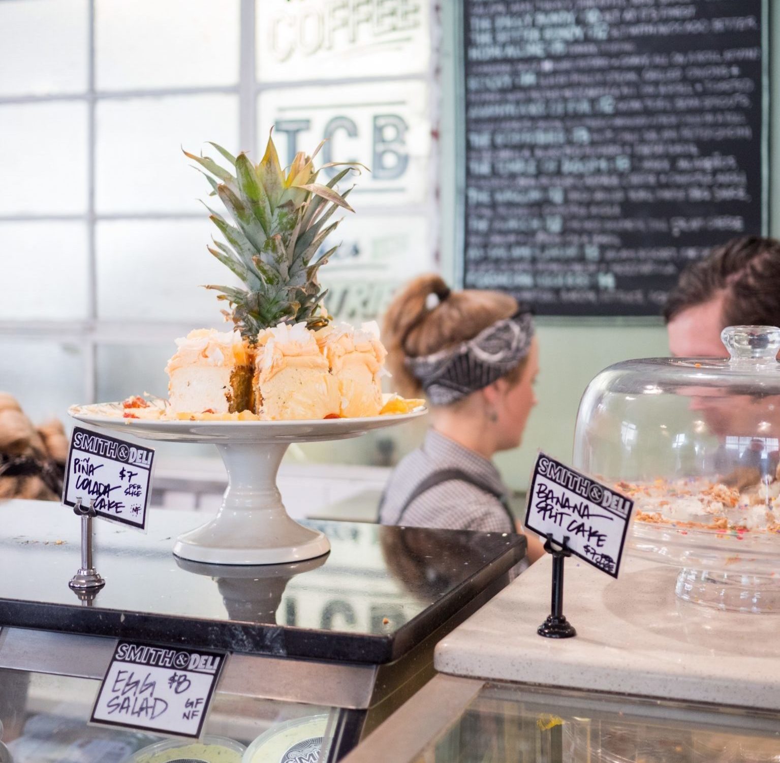
We know that certain purchases are classic coffee shop impulse buys: cakes, pastries and biscuits are the prime examples (come on, if you have never had that “sod-it” moment and bought a random cake, pastry or chocolate bar then you need to double check you aren’t actually some kind of robot sent from the future) and we have all learnt from the supermarkets how having these items next to the till works. It magically encourages the customer to submit to their first instinct to grab that treat before the wheedling voice of reason dissuades them from that initial urge, the lack of “um” and “ah” thinking time plays to our advantage.

A customer who comes in because they want to eat has already made their decision to eat, so giving them the space and time to choose what they want makes sense, hence why most coffee shops have their sandwiches and meal options further from the till and closer to the door. Having the higher margin items at the front of the display doesn’t simply mean the customer sees them first, it also means they see them better and are more likely to choose them.
This display choice also works for the customer who didn’t come in to buy lunch. Because this is a more significant purchase which needs more consideration than the impulse choice of a slice of cake, extra time is needed to ease them into an unplanned decision. Hitting them with a display as soon as they enter the shop means that they have the maximum amount of time to come around to the idea before they reach the till.

Of course, we all now sell reusable cups, tote-bags, coffee beans, grinders, drippers and t-shirts and these items can make a massive contribution to revenue, but retaining the coffee shop vibe is vital to providing an authentic experience to the customer. Simply dragging them along a display of everything available is likely to do more harm than good.
Instead, mention of a discount for using a reusable cup on the coffee menu board echoed by just a couple of cups on display nearby could be more than enough to sway the customer to buy one.
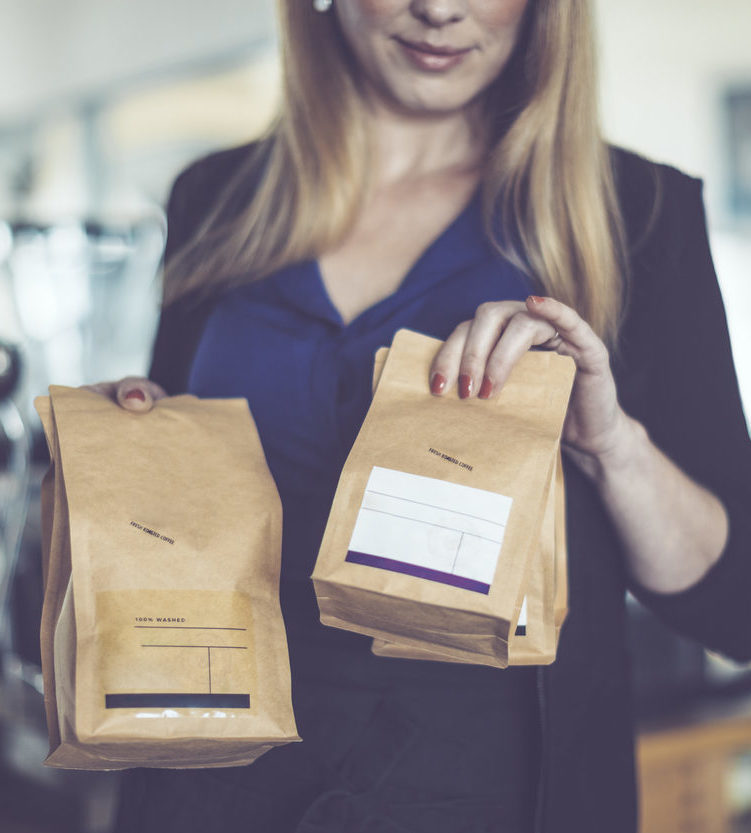
The other item sales are more likely to come from repeat or loyal customers: buying the beans is usually a result of familiarity with the shop’s coffee, a bag or t-shirt with the shop’s name is more likely to be bought by a customer who is a regular. This means that these items can be displayed away from the main counter and till, regular customers or customers who make longer visits can take the time to familiarise themselves with the product and a longer sales pipeline can be created.
So, what is the message? How does customer flow affect a speciality coffee shop? What can we do about customer flow? I think really, we need to understand that poor customer flow can steal sales and revenue, it can destroy the opportunity to develop loyal, happy customers and it sabotages the opportunities we have to generate extra sales and revenue. Whereas getting it right means we have more customers, happier customers, more regular customers and many more customers who spend more than they had intended. If this isn’t a good argument for looking at the design and layout of your shop and how it affects the movement of your customers, then nothing is.

